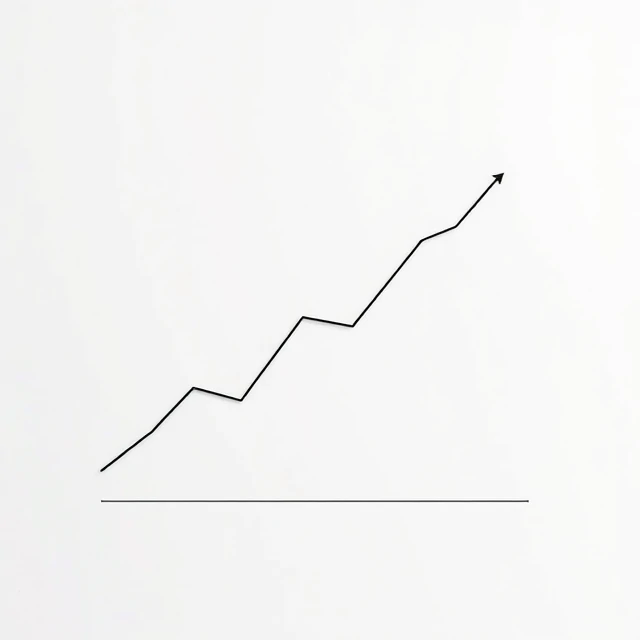
A chart turns numbers into a picture. The right chart makes a trend obvious. The wrong one hides it or misleads. A line chart shows change over time. A bar chart compares categories. A pie chart shows parts of a whole, though it struggles past four or five slices. A scatter plot reveals relationships between two variables. Each has a job.
Edward Tufte's work on data visualization set the standard: maximize the data-ink ratio, remove everything that does not convey information. No 3D effects. No unnecessary gridlines. No decorative backgrounds. The chart should communicate, not decorate. The most common mistake is choosing a chart type that flatters the data instead of revealing it. A truncated y-axis exaggerates small changes. A pie chart with twelve slices is unreadable. A dual-axis chart can imply correlation that does not exist. Good charts start with a question. What are you trying to show? The answer determines the form. A chart is a communication tool. If the viewer cannot understand it in five seconds, it has failed.
Chart types and uses
- Line — trends over time
- Bar — comparisons across categories
- Pie — proportions, best with few slices
- Scatter — relationships between variables
- Histogram — distribution of a single variable
The best chart is the one the audience understands without explanation. Simplicity wins.
Comments
No comments yet. Be the first to share a thought.
Leave a comment