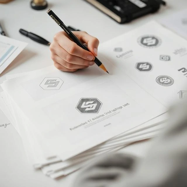
A logo is a shortcut. Instead of reading a company name, the eye recognizes a shape, a color, or a symbol in a fraction of a second. That speed is why logos appear on everything from packaging to stadium banners.
Good logos survive shrinking, printing in one color, and being stitched onto fabric. They avoid fine details that disappear at small sizes and avoid trends that date quickly. The best ones feel inevitable, as if they could not have been designed any other way.
Common logo types
- Wordmarks built from the company name
- Letter marks using initials
- Pictorial marks showing an object
- Abstract symbols without literal meaning
Redesigns generate strong reactions. Audiences often hate a new logo at first and accept it within a year. Brands that change too often lose the recognition the mark was built to earn.
Comments
No comments yet. Be the first to share a thought.
Leave a comment