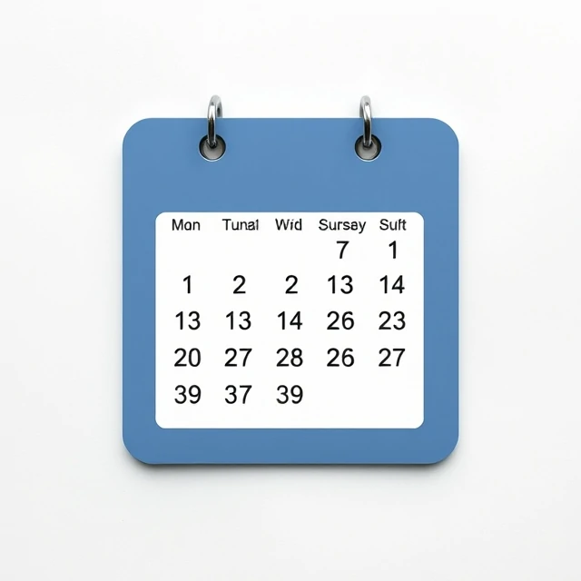
Early iPhone apps had leather stitching, green felt tables, and wooden bookshelves. That style is skeuomorphism: designing digital interfaces to mimic real-world objects and textures. The word comes from the Greek skeuos, meaning vessel or tool. A skeuomorph is a decorative element that recalls the original material even when it is no longer needed. The shutter sound on a phone camera is a skeuomorph. So is a digital calendar with a spiral binding.
Skeuomorphism dominated early digital design because it helped users understand new tools by analogy. A notebook app looked like a notebook. A calculator looked like a calculator. As users grew comfortable with touchscreens, the style faded. Apple's 2013 iOS 7 redesign pushed toward flat design with minimal texture. Today skeuomorphism survives in selective places: game interfaces, children's apps, and nostalgic products.
Where it still works
- Games that need immersive physical metaphors.
- Apps for young children or first-time users.
- Nostalgic or retro-themed products.
- Sound and haptic cues that reference physical objects.
Skeuomorphism is not wrong. It is a tool. Used well, it reduces the learning curve. Used poorly, it clutters the screen with textures that no longer serve a purpose.
Comments
No comments yet. Be the first to share a thought.
Leave a comment