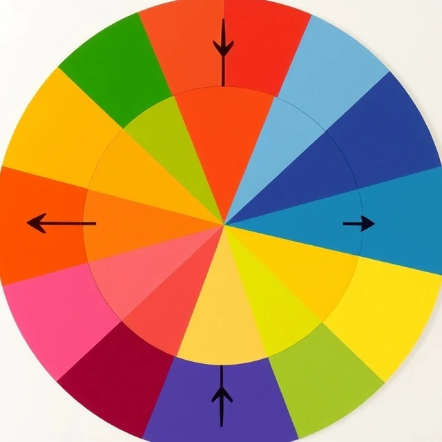
Mix two primary colors and you get a secondary color. In the traditional subtractive model used by painters, red and yellow make orange, blue and yellow make green, red and blue make purple. In the additive RGB model used by screens, the secondaries are cyan, magenta, and yellow. Same idea, different primaries, different results.
This is where a lot of confusion starts. A child learns that red and blue make purple. Then they open Photoshop, mix red and blue light, and get magenta. Neither is wrong. The two models describe different physical processes. Paint absorbs light. Screens emit it.
Secondary colors by model
- Subtractive (paint, ink): orange, green, purple
- Additive (light, screens): cyan, magenta, yellow
- CMYK printing uses cyan, magenta, yellow, and black
Secondary colors matter for palette building. A designer might choose a primary hue for a brand, then use its secondaries for accents and supporting elements. The relationship between primaries and secondaries creates harmony or contrast depending on how they are placed on the color wheel. Adjacent colors feel calm. Opposite colors, called complements, feel tense and energetic. Secondary colors sit at the center of that system.
Comments
No comments yet. Be the first to share a thought.
Leave a comment