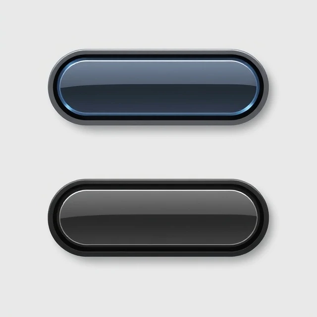
Flat design strips away depth, shadow, and texture. Buttons are simple rectangles. Icons are solid shapes. Colors are bold. The style emerged in the early 2010s and became mainstream with Microsoft's Metro interface and Apple's iOS 7 redesign in 2013. It was a reaction to the heavy skeuomorphism that preceded it, where digital objects mimicked leather, wood, and glass. Flat design said: this is a screen. Stop pretending otherwise.
The style has advantages. It loads faster, scales cleanly, and looks modern. It also creates problems. Without shadows or depth cues, it can be hard to tell what is clickable. Early flat interfaces confused users who could not distinguish buttons from labels. Designers responded with flat 2.0, sometimes called almost flat design, which adds subtle shadows, gradients, and motion to restore clarity without returning to full skeuomorphism. Google's Material Design, introduced in 2014, is a well-known example.
Common traits
- No gradients, shadows, or bevels.
- Simple geometric shapes.
- Bold, saturated colors.
- Clean sans-serif typography.
Flat design is not just a look. It reflects a shift in how people understood digital interfaces. The screen is not a desk. It is its own medium.
Comments
No comments yet. Be the first to share a thought.
Leave a comment