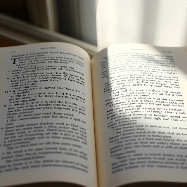
Look at the bottom of a capital T in Times New Roman. Those small horizontal strokes at the ends of the arms are serifs. They are the decorative feet and brackets that distinguish serif typefaces from their cleaner sans-serif cousins.
The style goes back to Roman stone carving, where masons added finishing strokes to letters before chiseling. Trajan's Column, carved around 113 AD, shows the classic form. Later, scribes and early printers adapted those strokes into metal type. For centuries, almost all printed text used serifs.
Serif typefaces in practice
- Common in books, newspapers, and long-form reading
- Often used for headlines in editorial design
- Signals tradition, authority, or formality
- Includes subcategories like old style, transitional, and modern
There is a persistent belief that serif fonts are more readable in print. The research is mixed. Some studies show a small advantage. Others find no difference. What matters more is typeface quality, size, and spacing. A well-set serif at 11 points reads beautifully. A cramped one at the same size does not. Pick serifs for the tone they set, not for a readability rule that may not hold up.
Comments
No comments yet. Be the first to share a thought.
Leave a comment