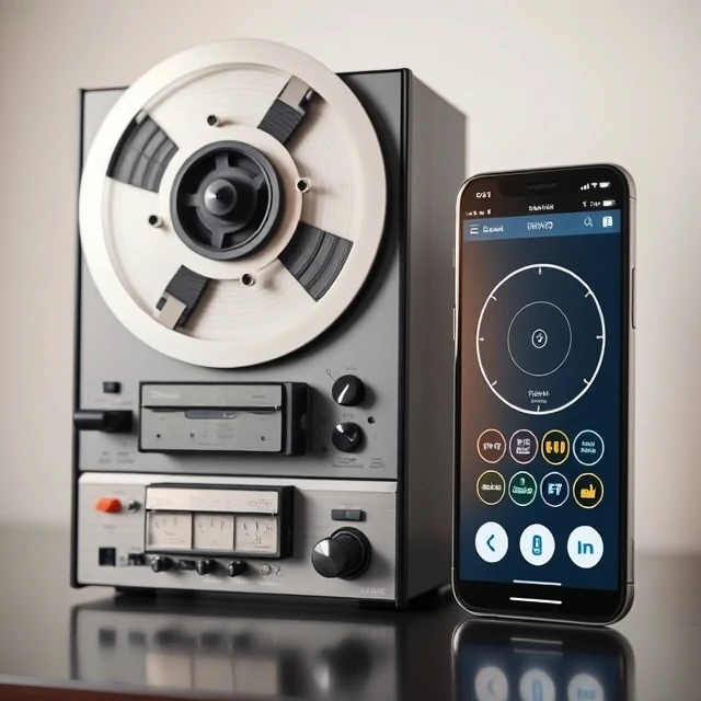
Early iPhone apps had leather stitching. The Notes app looked like a yellow legal pad. The Podcasts app had a reel-to-reel tape deck. Skeuomorphism is a design style that mimics real-world textures, materials, and objects in digital interfaces. The idea was to make unfamiliar technology feel familiar by borrowing from the physical world.
Apple championed the style under Steve Jobs. Then in 2013, iOS 7 stripped it all away in favor of flat design. Skeuomorphism became a punchline overnight. But the style never disappeared entirely. It shows up in camera apps that click like shutters, e-readers that flip pages, and note-taking apps that simulate handwriting on paper.
Why designers used it
- Familiar metaphors reduce learning time
- Textures and shadows suggest how elements behave
- Physical cues signal affordances like buttons and switches
The critique is fair. Heavy skeuomorphism can feel dated and cluttered. Leather textures do not help anyone tap a button. But some skeuomorphic cues are genuinely useful. A shadow under a button tells you it can be pressed. A trash can icon tells you where deleted files go. The best modern interfaces borrow selectively, keeping the functional cues and dropping the decorative nostalgia.
Comments
No comments yet. Be the first to share a thought.
Leave a comment