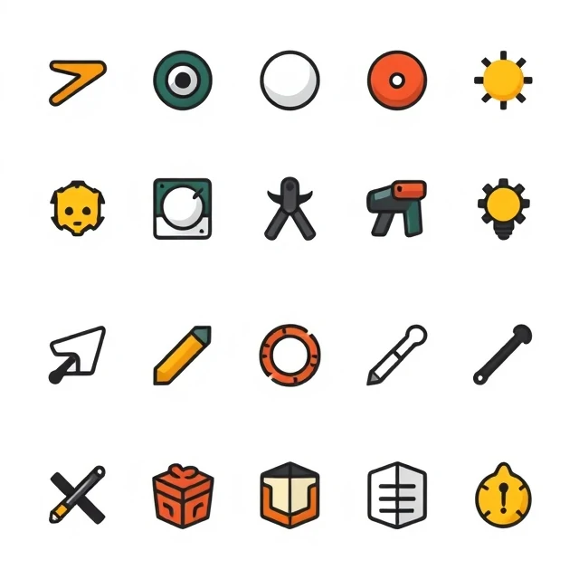
Flat design uses simple shapes, bold colors, and no depth effects. No shadows, no gradients, no bevels, no textures. The style emerged as a reaction to skeuomorphism, which imitated real-world materials. Early iPhone interfaces had leather stitching, glass buttons, and paper textures. Flat design stripped all of that away. The result was clean, modern, and fast to render. Microsoft's Metro design language and Apple's iOS 7 popularized it.
Flat design has trade-offs. Without shadows or depth cues, interactive elements can be hard to identify. A button that looks like a colored rectangle might not read as clickable. Designers solved this with subtle shadows and hover states, leading to what some call flat 2.0 or material design. The style also sacrifices visual richness. Gradients and textures can add warmth and personality. Flat design can feel sterile if executed without care. Typography becomes more important because there is less visual decoration to carry the design. Color palettes carry more weight. Illustration and iconography must be distinctive. Flat design is not just an aesthetic. It is a philosophy. It prioritizes clarity and function over ornamentation. When it works, it is elegant. When it fails, it is boring.
Flat design characteristics
- No shadows — elements sit on a single plane
- No gradients — solid colors only
- Simple shapes — circles, rectangles, and lines
- Bold typography — type carries the design
- Vibrant colors — flat palettes with high contrast
Flat design is minimalism applied to interfaces. It removes everything that does not serve a purpose.
Comments (2)
Leave a comment