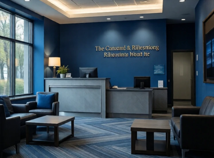
Color psychology studies how colors affect mood, behavior, and perception. Red raises heart rate and draws attention. Blue calms and signals trust. Yellow lifts mood but can also feel cheap in large doses. These associations are not universal. They shift across cultures and contexts. White means purity in many Western countries and mourning in parts of Asia. Green means nature in some places and danger in others, depending on the shade.
Marketers and designers use these associations carefully. Banks favor blue because it suggests stability. Fast food chains use red and yellow because they stimulate appetite and urgency. Health brands lean on green and white. But the effect is often weaker than the folklore suggests. Context, shape, and typography matter as much as hue. A red button on a calm blue page will attract attention regardless of what red is supposed to mean.
Common associations in Western design
- Red: urgency, passion, danger.
- Blue: trust, calm, reliability.
- Yellow: optimism, caution, warmth.
- Green: nature, health, growth.
Color psychology is a starting point, not a formula. Test with real users. What works for one audience may fall flat with another.
Comments
No comments yet. Be the first to share a thought.
Leave a comment