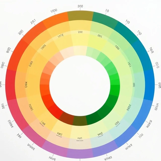
Two reds can feel completely different. One looks like a fire engine. The other looks like dried blood. The difference is saturation, the intensity or purity of a color. A fully saturated red is vivid and unmixed. Desaturate it and it moves toward gray.
In digital color, saturation is one axis of the HSL model, alongside hue and lightness. Drop saturation to zero and you get a grayscale image. Crank it up and colors compete for attention. Photographers often reduce saturation in the background to make a subject pop. Filmmakers use heavy desaturation to create a bleak or documentary mood.
Saturation in context
- High saturation: vivid, energetic, attention-grabbing
- Low saturation: muted, calm, understated
- Zero saturation: grayscale
- Over-saturation: colors clip and lose detail
There is a practical limit. Push saturation too far and colors blow out, especially in highlights. Skin tones turn orange. Shadows turn into solid blocks of color. Designers working on brand systems often set saturation ranges to keep a palette coherent. A logo that looks great at full saturation might look garish on a large background. Saturation is a dial, not a switch.
Comments
No comments yet. Be the first to share a thought.
Leave a comment