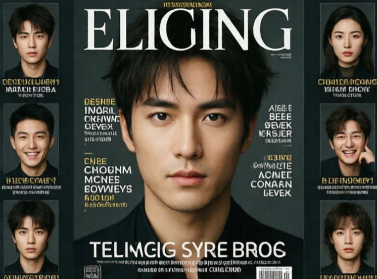
Emphasis makes one element the focal point of a design. Without it, everything competes equally and the viewer does not know where to look. With it, the eye lands on the intended spot first. Emphasis can come from size, color, contrast, position, or isolation. A large headline, a bright button, a single image surrounded by empty space. The tools vary, but the goal is the same: direct attention.
Designers usually choose one primary emphasis per screen or page. Two competing focal points confuse the viewer. That does not mean everything else must be dull. Secondary and tertiary elements can have their own weight, as long as the hierarchy is clear. A magazine cover might emphasize the main story with a large photo, while smaller teasers sit along the edge. The reader knows where to start and where to go next.
Ways to create emphasis
- Size: make it bigger than everything else.
- Color: use a hue that stands out.
- Contrast: place light against dark.
- Isolation: surround it with empty space.
Emphasis is not the same as decoration. A bold element that serves no purpose is just noise. Emphasis should point to what matters.
Comments (2)
Leave a comment