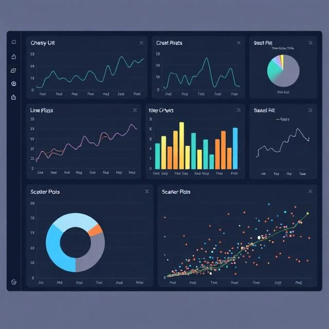
Data visualization represents data graphically to reveal patterns. A table of a thousand numbers is hard to read. A line chart of the same data shows the trend instantly. Visualization exploits the human visual system. We are good at spotting patterns, outliers, and changes. We are bad at mentally processing tables of numbers. Charts bridge that gap.
Good visualization starts with the question. What are you trying to show? Comparison, distribution, composition, relationship, or trend? Each question suggests a chart type. Comparison favors bars. Distribution favors histograms or box plots. Composition favors stacked bars or treemaps. Relationships favor scatter plots. Trends favor lines. Choosing the wrong chart type obscures the answer. A pie chart with twelve slices is unreadable. A line chart with categorical data on the x-axis is misleading. Color, scale, and labeling all matter. A truncated y-axis exaggerates small changes. Rainbow color scales are hard to read and inaccessible to colorblind viewers. The best visualizations are simple. They strip away decoration and let the data speak. Edward Tufte called this maximizing the data-ink ratio. Every pixel should carry information or get out of the way.
Visualization types by purpose
- Comparison — bar charts, dot plots
- Distribution — histograms, box plots
- Composition — stacked bars, treemaps, pie charts
- Relationship — scatter plots, heatmaps
- Trend — line charts, area charts
A chart is an argument. It should make the point clear without misleading the viewer.
Comments
No comments yet. Be the first to share a thought.
Leave a comment