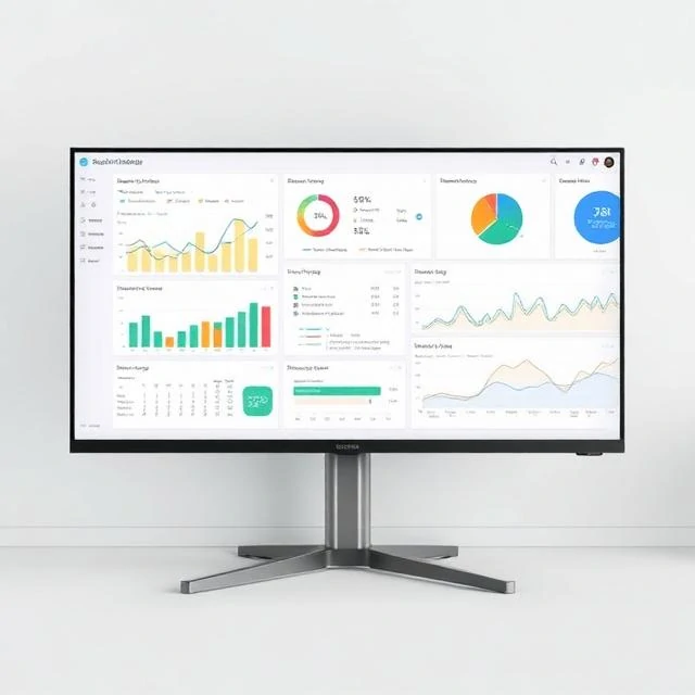
A dashboard puts key metrics in one view. Sales figures, website traffic, server health, inventory levels. The goal is to answer common questions at a glance. A good dashboard shows what matters and nothing else. A bad one shows everything and helps no one.
Dashboard design follows a few principles. Put the most important metrics at the top left, where the eye lands first. Use consistent colors and scales. Avoid clutter. Show trends, not just current values. A number without context is meaningless. A dashboard that shows 10,000 users means nothing without knowing whether that is up or down from last week. Interactivity helps. Filters, drill-downs, and date ranges let users explore without leaving the page. But too much interactivity slows load times and complicates the interface. The best dashboards are role-specific. An executive dashboard looks different from an operations dashboard. The executive wants trends and exceptions. The operator wants current status and alerts. Trying to serve both with one dashboard serves neither.
Dashboard best practices
- Know the audience — different roles need different views
- Prioritize — most important metrics first
- Provide context — comparisons, targets, trends
- Keep it simple — fewer metrics, clearer signals
- Update reliably — stale data erodes trust
A dashboard is a conversation between data and decision. If it does not lead to action, it is decoration.
Comments
No comments yet. Be the first to share a thought.
Leave a comment