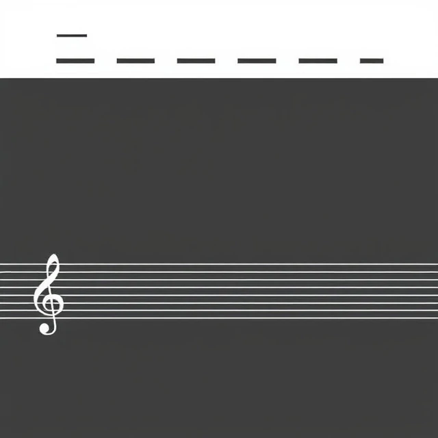
Scroll through a well-designed page and your eye moves in a pattern. That pattern is rhythm, and it comes from repeated elements spaced at intervals. A row of icons. A series of headings. Alternating image and text blocks. Rhythm gives a design a pulse.
In visual terms, rhythm works like it does in music. Regular beats create predictability. Syncopation, where the beat shifts unexpectedly, creates tension. A designer might use consistent spacing between sections, then place one element slightly off-grid to draw the eye. The variation only reads as intentional because the underlying pattern is clear.
Types of visual rhythm
- Regular: even spacing, same elements, steady beat
- Progressive: elements change size or spacing in sequence
- Flowing: curved lines guide the eye through a composition
- Alternating: two or more elements swap in a repeating pattern
Architecture uses rhythm constantly. Think of a colonnade, columns marching in a line. Graphic design borrows the same logic. So does web design, where consistent padding and margins create a reading rhythm that keeps people on the page. Break the rhythm everywhere and you get chaos. Never break it and you get monotony.
Comments
No comments yet. Be the first to share a thought.
Leave a comment