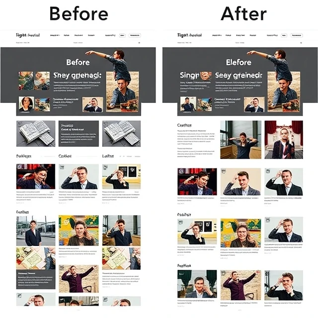
Put related things close together and people will assume they belong together. That simple principle is proximity, one of the core ideas in visual design. It comes from Gestalt psychology, which studied how the brain organizes visual input into patterns. When elements sit near each other, the eye groups them. When they sit far apart, the eye separates them. Designers use this deliberately to show structure without adding lines or boxes.
Proximity does a lot of quiet work. In a form, a label placed close to its input field reads as connected. Move the label halfway across the page and the relationship breaks. In a page layout, a heading placed nearer to the text below it than to the section above it signals which block it belongs to. Robin Williams popularized these ideas for non-designers in The Non-Designer's Design Book, grouping proximity with alignment, repetition, and contrast.
Practical uses
- Grouping labels with their form fields.
- Separating sections with space instead of lines.
- Clustering related navigation links.
- Using margins to signal hierarchy.
Proximity is cheap. It costs nothing but white space, and it often replaces visual clutter that would otherwise confuse the reader.
Comments
No comments yet. Be the first to share a thought.
Leave a comment