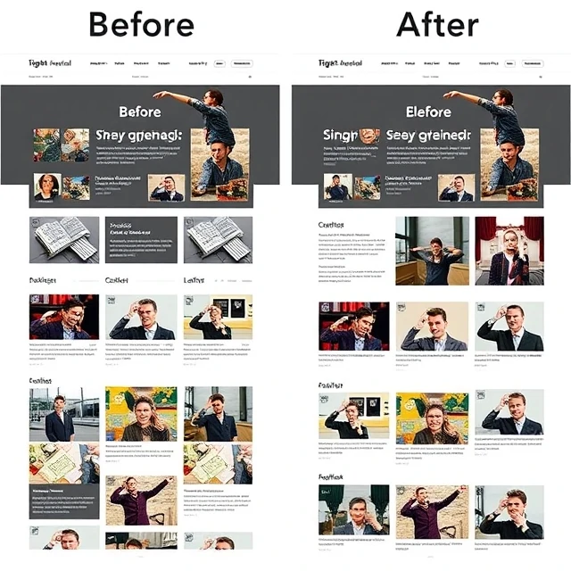
Letakkan hal-hal yang berkaitan berdekatan, dan orang akan menganggap bahwa hal-hal tersebut memang seharusnya berada bersama. Prinsip sederhana itu adalah kedekatan, salah satu ide inti dalam desain visual. Prinsip ini berasal dari psikologi Gestalt, yang mempelajari bagaimana otak mengatur masukan visual menjadi pola. Ketika elemen-elemen berada berdekatan, mata akan mengelompokkannya. Ketika elemen-elemen tersebut berada berjauhan, mata akan memisahkannya. Para desainer sengaja menggunakan prinsip ini untuk menunjukkan struktur tanpa menambahkan garis atau kotak.
Proximity does a lot of quiet work. In a form, a label placed close to its input field reads as connected. Move the label halfway across the page and the relationship breaks. In a page layout, a heading placed nearer to the text below it than to the section above it signals which block it belongs to. Robin Williams popularized these ideas for non-designers in The Non-Designer's Design Book
Practical uses
- Grouping labels with their form fields.
- Separating sections with space instead of lines.
- Clustering related navigation links.
- Using margins to signal hierarchy.
Proximity is cheap. It costs nothing but white space, and it often replaces visual clutter that would otherwise confuse the reader.
Comments
No comments yet. Be the first to share a thought.
Leave a comment