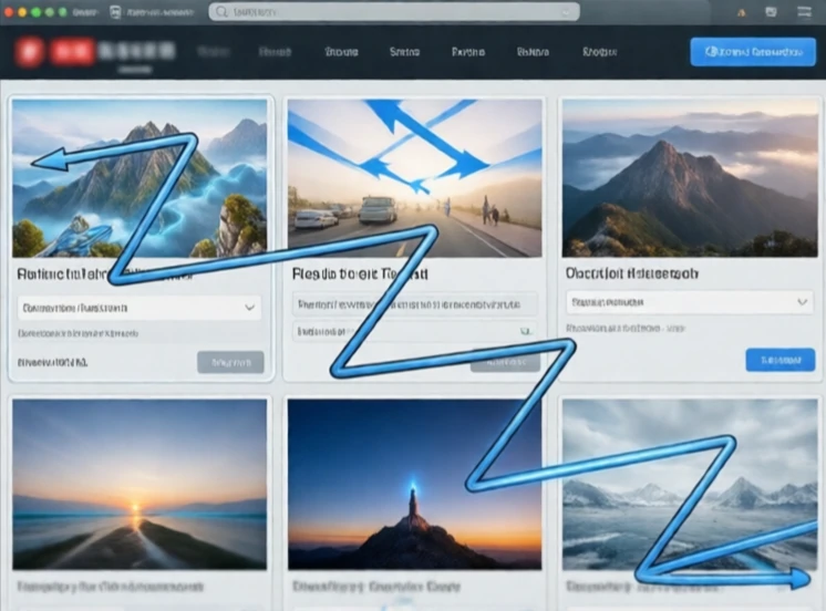
Movement in design guides the viewer's eye through a composition. It is not physical motion, though motion graphics add that. It is the sense that the eye is being led from one element to another in a deliberate path. Designers create movement with lines, shapes, color, and placement. A diagonal line suggests energy. A curved line suggests flow. A repeated element creates a path the eye follows automatically.
The Z-pattern and the F-pattern are common eye paths on web pages. In the Z-pattern, the eye moves across the top, down to the opposite corner, then across again. It works well for simple landing pages with a clear call to action. The F-pattern describes how people scan text-heavy pages, reading the first few lines fully and then skimming down the left edge. Designers place key information along these paths.
Tools for creating movement
- Lines and arrows that point the way.
- Repeated shapes that form a path.
- Color gradients that pull the eye.
- Size changes that create a visual slope.
Movement is not about making things busy. It is about making the eye travel in a way that feels natural and leads to the most important content.
Comments
No comments yet. Be the first to share a thought.
Leave a comment