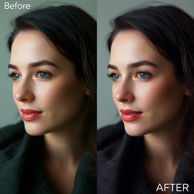
Colors in a photograph are not always what the eye saw. A camera's sensor records light, but it does not interpret color the way the brain does. Fluorescent lights turn skin green. Tungsten lights turn it orange. Shade turns it blue. Color correction is the process of adjusting an image so that colors look accurate or natural, or so that they match a specific creative intent.
The process starts with white balance, which sets the neutral point. If white is white, other colors fall into place. Beyond white balance, color correction involves adjusting hue, saturation, and luminance for individual color ranges. A portrait might need warmer skin tones. A landscape might need deeper greens. A product shot might need precise color matching to the actual item. Color correction is not the same as color grading. Correction aims for accuracy. Grading aims for mood. Both are part of post-processing, and both rely on calibrated monitors and a controlled viewing environment.
Tools for color correction
- White balance. Sets the neutral point.
- Curves. Adjusts tone and color across the image.
- HSL. Adjusts hue, saturation, and luminance per color.
- Color checker. A reference chart for accurate matching.
Color correction is technical, but it is also perceptual. The eye adapts to color casts, so a monitor that is slightly off can lead to corrections that are slightly wrong.
Comments
No comments yet. Be the first to share a thought.
Leave a comment