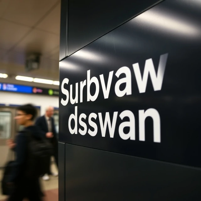
Strip the little feet off a letter and you get a sans-serif typeface. No decorative strokes at the ends of stems. No brackets connecting curves to verticals. Just clean, geometric forms. Helvetica, Futura, Arial, and Inter all belong to this family.
The style is younger than serif typography. It gained traction in the 19th century for signage and advertising, where legibility at a distance mattered more than tradition. The Bauhaus designers embraced it in the 1920s as a symbol of modernity. Then Swiss designers in the 1950s turned it into a global standard. Helvetica became the face of corporations, transit systems, and government forms.
When sans-serif works best
- Screen interfaces and mobile apps
- Signage and wayfinding systems
- Headlines that need to feel contemporary
- Small text where serifs would clog
On low-resolution screens, sans-serif fonts hold up better than their serifed cousins. The fine details of a serif can blur or disappear at small sizes. That is one reason most operating systems use sans-serif for their interface text. But sans-serif is not automatically more readable. A poorly spaced sans-serif font can be harder to read than a well-designed serif. The genre matters less than the execution.
Comments
No comments yet. Be the first to share a thought.
Leave a comment