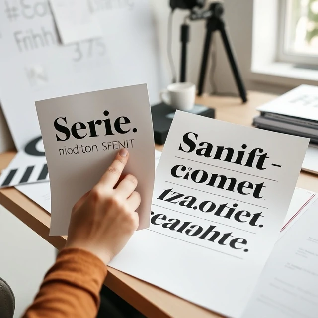
A font is a specific size, weight, and style of a typeface. Helvetica is a typeface. Helvetica Bold 14pt is a font. The distinction matters in professional practice. A typeface is the design. A font is the delivery. In digital design, the line has blurred. Designers say "font" when they mean "typeface" and everyone understands. But the technical difference remains. A typeface family includes many fonts. Regular, italic, bold, light, condensed, extended. Each variation is a separate font file.
Font choice affects readability and tone. Serif fonts have small strokes at the ends of letters. They feel traditional and authoritative. Sans-serif fonts lack those strokes. They feel modern and clean. Script fonts imitate handwriting. They feel personal and elegant. Display fonts are designed for headlines. They have personality but are hard to read in long passages. Body text needs a font that disappears. The reader should focus on the content, not the letterforms. Headlines can use something more expressive. The contrast between the two creates hierarchy. Font pairing is a skill. Two fonts should complement each other without competing. A serif headline with a sans-serif body is a classic combination. Two similar sans-serifs look like a mistake. Two wildly different fonts look chaotic. The pairing should feel intentional.
Font categories
- Serif — traditional, readable in print
- Sans-serif — modern, clean, good for screens
- Script — handwritten style, decorative
- Display — designed for headlines and logos
- Monospace — fixed width, used for code
A font is a tool. The right one supports the message. The wrong one distracts from it.
Comments
No comments yet. Be the first to share a thought.
Leave a comment