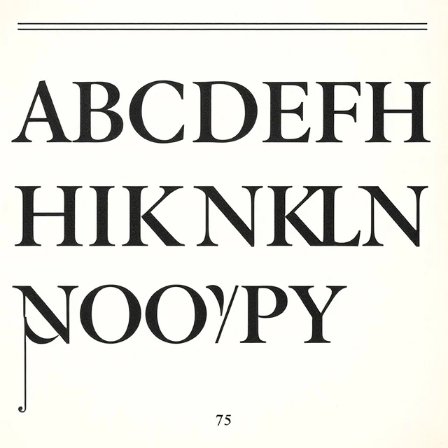
The baseline is the invisible line on which characters sit in typography. Letters like a, m, and x rest directly on it. Letters with descenders, like g, p, and y, drop below it. Letters with ascenders, like b, d, and h, rise above the x-height. The baseline anchors the text and keeps it aligned across a line.
Baselines matter for more than single lines of text. In multi-column layouts, aligning baselines across columns creates a subtle rhythm that makes the page easier to read. Designers use a baseline grid, a series of horizontal lines spaced at regular intervals, to align text blocks across a spread or webpage. When baselines are misaligned, the page feels slightly off even if the viewer cannot identify the problem.
Baseline-related terms
- Baseline shift: moving a character up or down from the baseline.
- Baseline grid: horizontal lines for aligning text.
- X-height: the height of lowercase letters without ascenders.
- Descender: the part of a letter that drops below the baseline.
The baseline is invisible, but it does quiet work in every well-set page. Typographers notice when it is wrong. Readers only feel it.
Comments
No comments yet. Be the first to share a thought.
Leave a comment