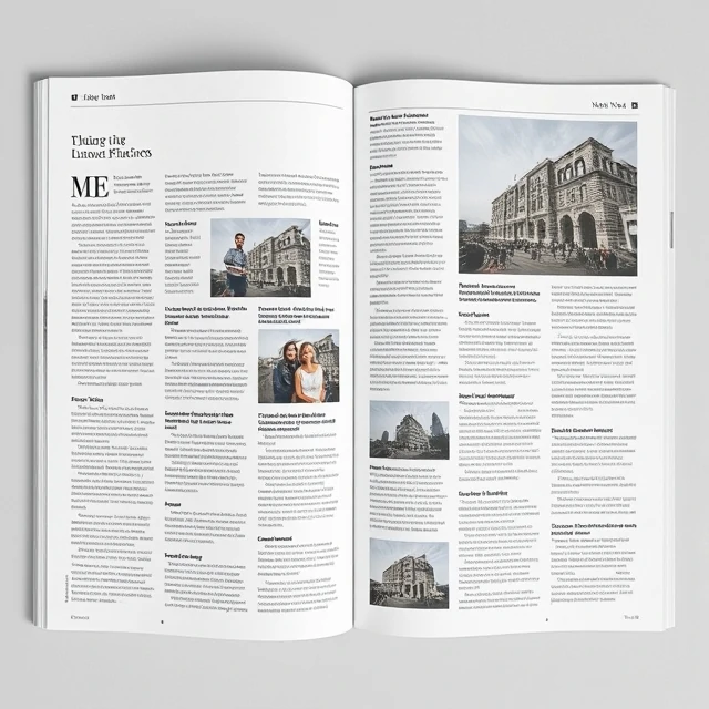
A grid is a structural framework of lines that aligns design elements. It divides a page into columns, rows, and margins. The designer places content within that structure. The grid brings order. It ensures consistency across pages or screens. It speeds up the design process because the designer does not start from scratch each time. The grid is the scaffolding. The design is the building.
Grids come in many forms. The manuscript grid divides a page into a single column of text with generous margins. It is used in books and long-form documents. The column grid uses multiple columns for flexible layouts. Newspapers and magazines use column grids. The modular grid combines columns and rows into a matrix of modules. It offers maximum flexibility for complex layouts. The hierarchical grid organizes content by importance, with different zones for different types of content. Each grid serves a purpose. The choice depends on the content and the medium. The grid is not a constraint. It is a tool. Breaking the grid draws attention. A full-bleed image that ignores the margins creates impact. A headline that spans multiple columns signals importance. The designer uses the grid and breaks it deliberately. Breaking it without reason looks like a mistake. The grid is the rule that makes breaking it meaningful.
Grid types
- Manuscript — single column, classic book layout
- Column — multiple columns for flexible layouts
- Modular — columns and rows forming a matrix
- Hierarchical — zones organized by content importance
- Baseline — horizontal lines for vertical rhythm
A grid is a system. It brings order to complexity. Without it, layout is guesswork.
Comments
No comments yet. Be the first to share a thought.
Leave a comment