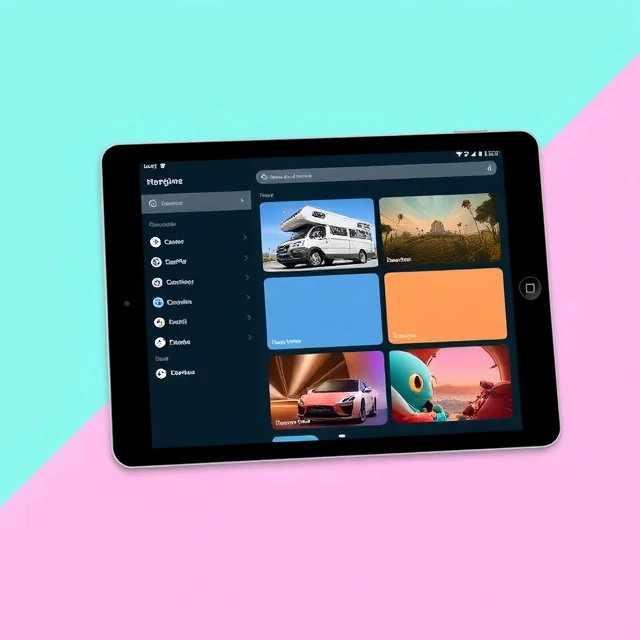
Google introduced Material Design in 2014 as a unified visual language for its products. The system treats interface elements as physical objects with depth, shadow, and motion. Cards lift off the surface. Buttons ripple when tapped. Transitions follow natural easing curves. The metaphor is paper, but paper that can stretch, fold, and cast shadows. The goal was consistency across Android, web, and Google's own apps.
Material Design is more than a look. It is a system of components, guidelines, and tools. It specifies typography, color, layout grids, elevation levels, and interaction patterns. Developers can use Material Components for Android, Flutter, and the web. Designers can follow the guidelines without building from scratch. The system has been updated several times, most notably with Material You in 2021, which introduced dynamic color that adapts to the user's wallpaper. Material Design has been criticized for being overly prescriptive and for making apps look alike. It has also been widely adopted beyond Google.
Core elements
- Elevation and shadow for depth.
- Motion and transitions for feedback.
- Grid-based layouts for structure.
- Bold color and typography for hierarchy.
Material Design is not a style to copy. It is a framework for making decisions consistently across a large product ecosystem.
Comments
No comments yet. Be the first to share a thought.
Leave a comment