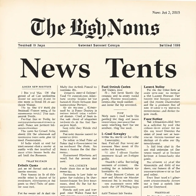
Serif typefaces carry small decorative lines at the ends of strokes. Times New Roman, Garamond, Baskerville, and Georgia are familiar examples. The serifs guide the eye along a line of text, which is why serif faces have long dominated book printing. The style dates back to Roman inscriptions, where carved letters naturally ended with flared strokes.
Serif faces come in many flavors. Old-style serifs like Garamond have gentle contrast and angled stress. Transitional faces like Baskerville are more refined. Modern serifs like Bodoni have sharp contrast between thick and thin strokes. Slab serifs like Rockwell have heavy, uniform lines. Each carries a different tone, from classical to authoritative to friendly. Choosing among them depends on the message.
Common uses
- Book and newspaper body text.
- Formal or traditional branding.
- Headlines in editorial design.
- Long-form reading on screens and paper.
Serif is not old-fashioned. Many contemporary brands use serif type to signal heritage or trust. The choice is not about age. It is about voice.
Comments
No comments yet. Be the first to share a thought.
Leave a comment