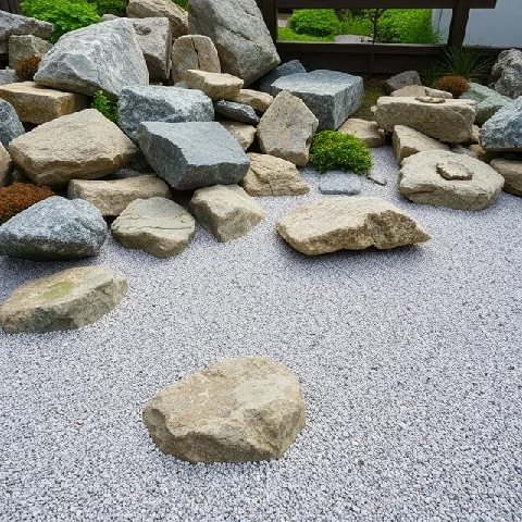
Asymmetry distributes visual weight unevenly across a composition. Unlike symmetrical layouts that mirror left and right, asymmetrical designs balance different elements against each other. A large photograph on the left might be balanced by a block of text on the right. A dark shape at the bottom might be offset by a bright accent at the top. The result feels dynamic rather than stable, and it often reads as more modern and less formal.
Asymmetry is harder to pull off than symmetry. There is no simple rule to follow. Designers rely on intuition and iteration, moving elements until the composition feels right. The goal is not perfect balance but a sense of equilibrium that holds the viewer's attention. Japanese design traditions, particularly the concept of ma and the aesthetics of wabi-sabi, have long embraced asymmetry as a way to create interest and express natural imperfection.
Where asymmetry works well
- Editorial layouts with mixed image and text blocks.
- Web pages with a dominant hero image and a smaller sidebar.
- Posters that want to feel energetic rather than formal.
- Brand identities that avoid conventional symmetry.
Asymmetry is not chaos. It requires a clear focal point and a deliberate arrangement of supporting elements. When it works, the eye moves through the composition without feeling lost.
Comments
No comments yet. Be the first to share a thought.
Leave a comment