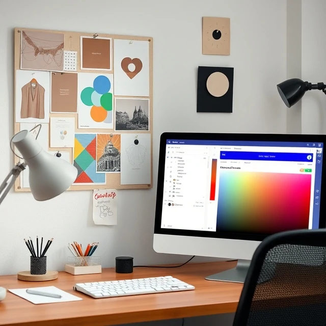
A palette is the selected range of colors used in a design. It might be two colors or twenty. What matters is that the choices work together and serve the project. A palette sets mood before a single word is read. Warm earth tones signal craft and tradition. Cool blues and grays suggest technology and calm. High-contrast palettes grab attention. Muted ones recede.
Designers build palettes from many sources: a photograph, a brand's existing materials, a seasonal trend, or a single object like a vintage postcard. The palette usually includes a primary color for emphasis, secondary colors for support, and neutrals for backgrounds and text. Accessibility matters. Contrast ratios between text and background must meet standards so that people with low vision can read the content. Tools like Adobe Color and Coolors help designers test combinations quickly.
Building a palette
- Choose a dominant color that carries the mood.
- Add one or two accent colors for emphasis.
- Select neutrals for text and background.
- Check contrast ratios for accessibility.
A palette is not permanent. Brands refresh their colors every few years, and designers often work within an existing system while nudging it forward.
Comments
No comments yet. Be the first to share a thought.
Leave a comment