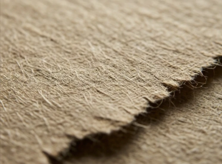
Texture is the surface quality of a design element. It can be literal, like the grain of wood or the weave of fabric. Or it can be visual, like a printed image of rough paper. Texture adds depth and richness. A flat design can feel clean and modern, but a touch of texture makes it feel tactile. Designers use texture to evoke materials, create mood, and break up large areas of flat color.
In digital design, texture often comes from photographs, overlays, or subtle noise. A hero image of crumpled paper. A background with a faint grain. A button with a slight gradient that mimics a physical surface. The line between texture and skeuomorphism is thin. A little texture adds warmth. Too much makes the interface feel dated or cluttered. The best digital textures are felt more than seen.
Where texture helps
- Adding depth to flat backgrounds.
- Evoking a material or craft process.
- Creating contrast between sections.
- Signaling a brand's tactile quality.
Texture is not decoration for its own sake. It should serve the design's message. A luxury brand might use a subtle paper texture. A tech brand might use a clean gradient. The choice tells the viewer something about the product.
Comments
No comments yet. Be the first to share a thought.
Leave a comment