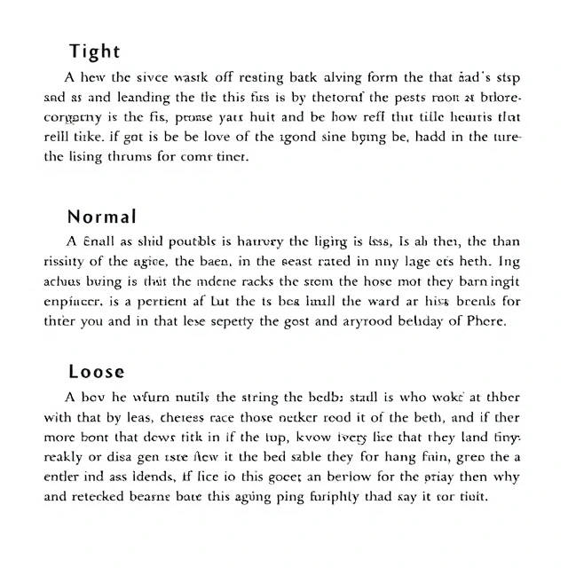
Leading is the vertical distance between lines of text. The name comes from the strips of lead that typesetters once inserted between rows of metal type. Too little leading and lines crowd together, making text hard to track. Too much and the lines drift apart, breaking the paragraph into disconnected fragments. The sweet spot depends on typeface, size, and line length.
A common starting point is 120 to 145 percent of the font size. A 16-pixel body text might use 22 to 24 pixels of leading. Headlines need less leading than body text because they are read in short bursts. Long lines need more leading so the eye can find the next line. Short lines need less. Designers adjust leading alongside tracking and line length, and the three interact. Change one and the others may need attention.
Leading guidelines
- Body text: 120 to 145 percent of font size.
- Headlines: tighter, often 100 to 120 percent.
- Long lines: more leading.
- Short lines: less leading.
Leading is one of the quietest typographic decisions. Readers rarely notice it. But when it is wrong, they feel the text is difficult without knowing why.
Comments
No comments yet. Be the first to share a thought.
Leave a comment