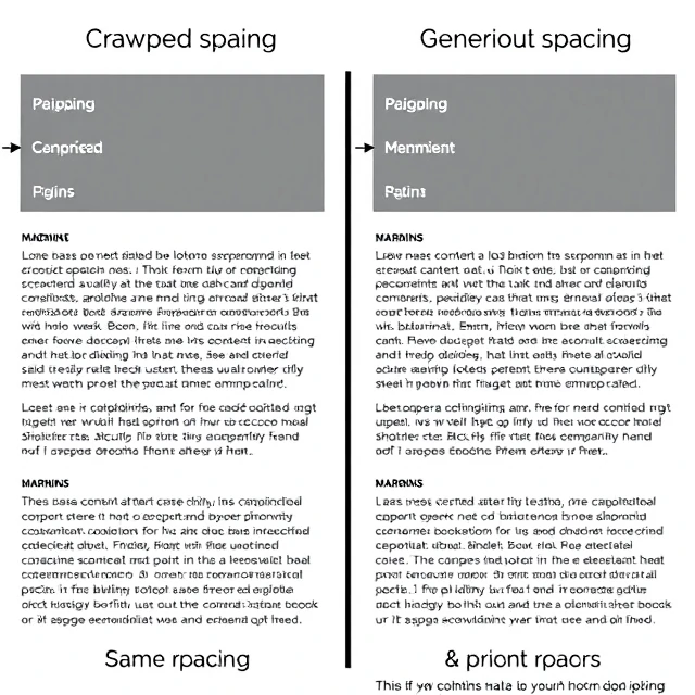
White space is not wasted space. It is the empty area around and between elements on a page. Margins, padding, gutters, line spacing, the space around a logo. Designers call it negative space. Beginners call it something to fill up. That instinct is almost always wrong.
Apple's product pages are a masterclass in white space. A single product photograph, a short headline, and then a lot of nothing. The emptiness makes the product feel premium. It also makes the message impossible to miss. Compare that to a page crammed with banners and pop-ups and text blocks. The eye has nowhere to rest.
What white space does
- Groups related elements and separates unrelated ones
- Improves readability by giving text room to breathe
- Creates focus by isolating important elements
- Sets tone: generous white space reads as elegant and calm
- Tight white space reads as energetic and dense
There is no universal correct amount. A news site needs tighter spacing than a luxury fashion brand. A dashboard with dense data needs different white space than a children's book. The trick is to use white space deliberately, not accidentally. When white space is consistent, the design feels stable. When it is uneven, the page feels broken even if nobody can say why.
Comments
No comments yet. Be the first to share a thought.
Leave a comment