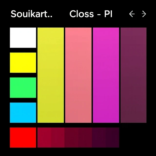
Take a pure blue and add black. The result is a shade. Not a tint, which uses white. Not a tone, which uses gray. Shade specifically means a color darkened by mixing in black pigment or reducing luminance in a digital color space.
The term gets used loosely in everyday speech, where any variation of a color might be called a shade. In color theory, the distinction matters. A tint of red is pink. A shade of red is maroon. A tone of red sits somewhere in the middle, muted and grayish. Artists mix shades on a palette. Digital designers adjust the lightness value in HSL or multiply the RGB values downward.
Shades in design work
- Create depth by darkening edges or shadows
- Build hover and active states for buttons
- Establish hierarchy in a monochromatic palette
- Suggest weight, grounding, or seriousness
Shades appear everywhere in interface design. A button that darkens on hover is using a shade of its base color. So is a card that casts a shadow. The trick is consistency. Pick a base hue and generate a family of shades from it, then reuse that family across the whole system. Random darkening produces muddy, incoherent color. Deliberate shading builds a visual language.
Comments
No comments yet. Be the first to share a thought.
Leave a comment