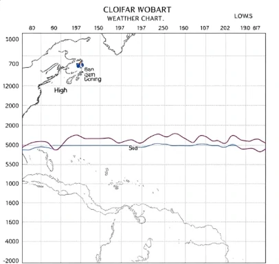
An isobaric chart displays atmospheric pressure patterns across a region by means of isobars. These maps are the standard tool for visualizing surface weather systems and the winds they drive.
Analysts plot sea-level pressure values from hundreds of stations and then draw the isobars that best fit the data. The resulting chart shows the location of highs, lows, troughs, and ridges. Fronts are often added to the same chart because they interact closely with the pressure field.
Pilots, mariners, and forecasters rely on sequential isobaric charts to see how systems are evolving. The charts also serve as a starting point for numerical model initialization. Modern versions are generated largely by computer, yet the underlying principle of connecting equal-pressure points remains unchanged.
A well-drawn isobaric chart still provides one of the clearest snapshots of the current weather pattern.
Comments
No comments yet. Be the first to share a thought.
Leave a comment