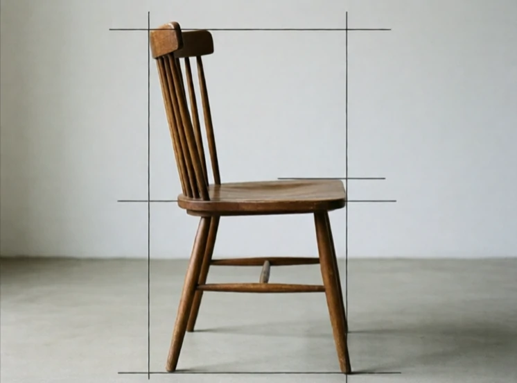
Proportion describes the relationship between the sizes of parts within a whole. A well-proportioned chair has a seat height, back height, and width that feel right together. A well-proportioned page has margins, columns, and text sizes that harmonize. Proportion is not about absolute size. A tiny object can be well proportioned. A huge one can be badly proportioned. What matters is how the parts relate.
Designers use proportion to create balance and hierarchy. The golden ratio is one famous system. The Modulor, developed by Le Corbusier, is another. But most proportion decisions are made by eye, adjusted until nothing feels off. In typography, the ratio between heading size and body size sets the tone. A modest ratio feels restrained. A dramatic one feels bold. In layout, the proportion of text to image, or content to margin, shapes how the page reads.
Proportion in practice
- Relate heading sizes to body text.
- Balance content area against margins.
- Check that objects fit the human body.
- Use ratios as starting points, then adjust by eye.
Proportion is felt before it is analyzed. When it is wrong, the design feels clumsy. When it is right, nothing draws attention to itself.
Comments
No comments yet. Be the first to share a thought.
Leave a comment