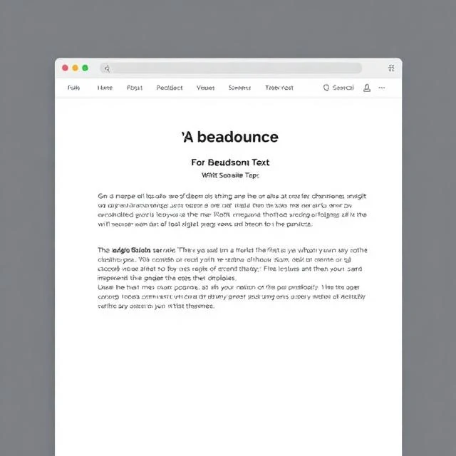
Hierarchy arranges elements by order of importance. It tells the viewer what to look at first, second, and third. A headline is larger than body text. A call-to-action button is brighter than its surroundings. A section title is bolder than the paragraphs beneath it. Hierarchy guides the eye through the design. Without it, everything competes for attention. Nothing wins. The viewer does not know where to start.
Hierarchy is created through contrast. Size, color, weight, position, and spacing all establish importance. A large element dominates. A bright color draws the eye. Bold type stands out. Elements at the top of a page are seen first. White space around an element gives it prominence. The designer combines these tools to build a clear visual order. Hierarchy is not just about making things big. It is about making the right things big. The most important element should be the most prominent. If everything is emphasized, nothing is. The designer must decide what matters most and design accordingly. Hierarchy also changes with context. A mobile screen has less space than a desktop. A poster is seen from a distance. A book is held close. The hierarchy adapts to the medium. The goal is the same: guide the viewer through the content in the intended order.
Hierarchy tools
- Size — larger elements draw attention first
- Color — bright or contrasting colors stand out
- Weight — bold type is more prominent
- Position — top and center are seen first
- Space — isolation gives an element importance
Hierarchy is the order of importance. It tells the viewer where to look and in what sequence.
Comments (3)
Leave a comment