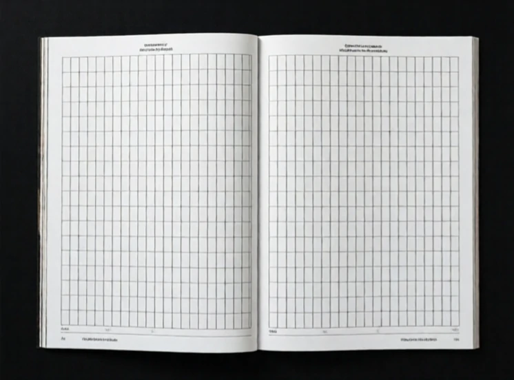
A grid system divides a page into columns and rows that guide where content goes. It brings order to layout. The Swiss designer Josef Müller-Brockmann codified grid principles in the 1960s, and his book Grid Systems in Graphic Design
A typical grid has columns, gutters, and margins. Columns hold content. Gutters separate columns. Margins frame the page. A 12-column grid is common on the web because it divides evenly into halves, thirds, quarters, and sixths. Designers can span multiple columns for wider content or use a single column for narrow text. The grid does not dictate the design. It provides a structure that the designer can follow, bend, or break deliberately.
Grid components
- Columns: vertical bands for content.
- Gutters: gaps between columns.
- Margins: outer edges of the layout.
- Baseline grid: horizontal lines for aligning text.
Breaking the grid can be powerful. A full-bleed image that ignores the columns draws attention precisely because it violates the structure. But the break only works if the grid is strong enough to be felt.
Comments
No comments yet. Be the first to share a thought.
Leave a comment