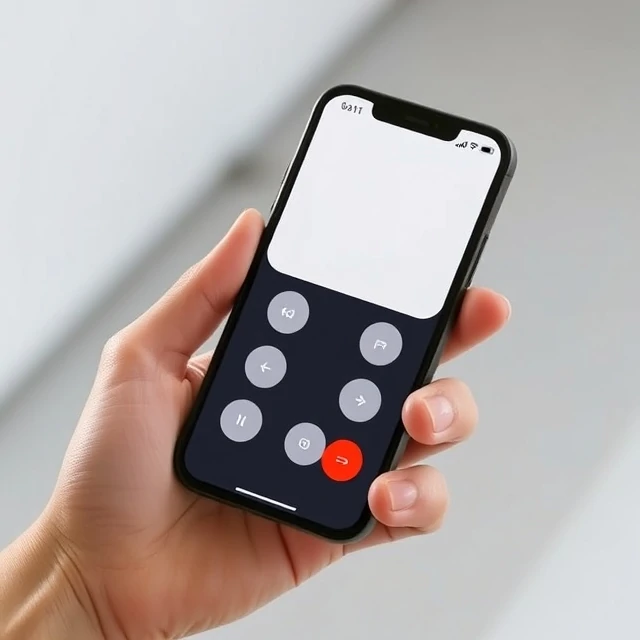
Luke Wroblewski gave the practice its name in 2009, but the logic was already pressing. Phones had become the primary way people reached the web, and designing desktop layouts first forced designers to cram complexity into small screens later. Mobile-first flips the order. Start with the smallest screen, decide what matters most, then expand upward to tablet and desktop layouts.
The constraint is productive. A narrow viewport forces triage. Navigation collapses into a menu. Content moves into a single column. Every feature must justify its space. Designers sketch thumb-friendly tap targets, consider one-handed use, and plan for slow connections. When the design grows to a larger screen, extra space gets used for breathing room and secondary panels rather than crammed with new clutter.
Core practices
- Begin wireframes at phone width.
- Prioritize content hierarchy ruthlessly.
- Design touch targets at least 44 pixels.
- Scale up to tablet and desktop last.
Responsive design and mobile-first often travel together. Mobile-first sets the priority. Responsive handles the adaptation across breakpoints.
Comments
No comments yet. Be the first to share a thought.
Leave a comment