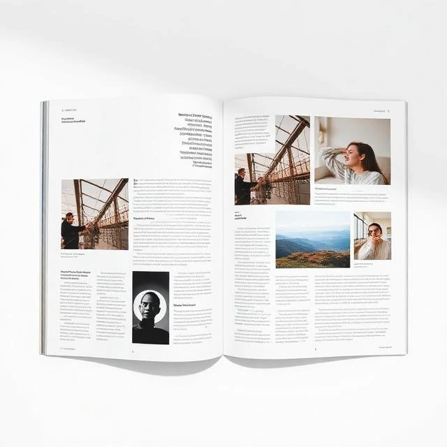
Layout arranges text and images on a page or screen. It decides where things go and how much space they occupy. A layout can be dense or airy. It can be symmetrical or asymmetrical. It can follow a grid or break free of it. The layout determines how the viewer experiences the content. A cluttered layout overwhelms. A sparse one feels empty. The right balance depends on the message and the medium.
Layout principles have been refined over centuries. Print design established the rules. Margins give the content room to breathe. Columns organize text for readability. White space separates elements and guides the eye. Hierarchy shows what matters most. Digital design adapted these principles to screens. Responsive layouts adjust to different screen sizes. A three-column desktop layout becomes a single column on mobile. The content reflows. The hierarchy persists. Layout also affects usability. A button placed where users expect it gets clicked. A navigation menu in the standard location gets used. A form with clear labels and logical grouping gets completed. The layout is not just aesthetic. It is functional. It shapes behavior. The designer uses layout to guide, to inform, and to persuade. Every placement is a decision. Every decision has consequences.
Layout principles
- Margins — space around the content
- Columns — vertical divisions for text
- White space — empty areas that separate elements
- Hierarchy — order of visual importance
- Alignment — elements line up along common edges
- Proximity — related elements are grouped together
Layout is the arrangement of parts. The parts matter. So does the space between them.
Comments
No comments yet. Be the first to share a thought.
Leave a comment