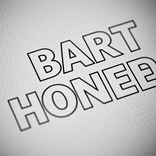
Tracking adjusts the overall spacing between characters in a block of text. It differs from kerning, which adjusts the space between two specific letters. Tracking applies uniformly across a range. Designers tighten tracking to fit more text in a space or to make headlines feel dense and forceful. They loosen it to add air, improve legibility at small sizes, or create a sense of elegance.
Display type often needs tighter tracking than body text. Large headlines set at default spacing can look loose and disconnected. Body text, especially at small sizes on screens, often benefits from slightly looser tracking. All-caps text almost always needs extra tracking, because capital letters have less variation in shape and can blur together. Negative tracking on body text is risky. Letters start to touch and legibility drops.
When to adjust tracking
- Tighten large headlines for impact.
- Loosen small text for readability.
- Add tracking to all-caps text.
- Avoid negative tracking on body copy.
Tracking is measured in ems or thousandths of an em. A value of 0 is default. Positive values add space. Negative values remove it. Small changes make a visible difference.
Comments
No comments yet. Be the first to share a thought.
Leave a comment