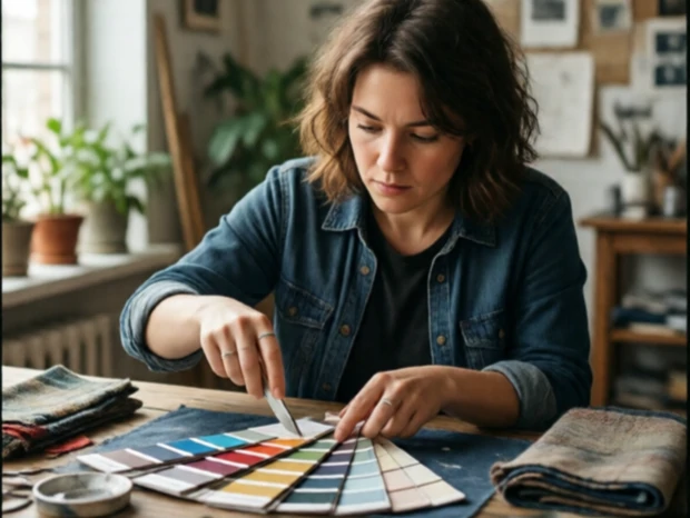
A color palette is the specific range of colors a designer uses in a collection. It is a deliberate choice, not a random selection. A palette might be built around neutrals like cream, grey, and black. Another might feature bold reds, oranges, and yellows. The palette ties the pieces together and sets the emotional tone. Warm colors feel energetic. Cool colors feel calm. Muted tones feel sophisticated. Saturated ones feel playful.
Designers develop palettes in different ways. Some start with a single color that inspires them. Others pull from a reference image, a painting, or a landscape. Pantone publishes a color of the year and seasonal forecasts that influence many brands. The palette is then tested on fabrics, because the same color looks different on silk, wool, or leather. Dye lots vary. Getting consistent color across a collection is a technical challenge.
The palette also shapes styling and marketing. Photoshoots, packaging, and social media use the same colors. A strong palette makes a collection recognizable at a glance. Think of a brand known for a particular shade. That color becomes part of its identity. The right palette can make a collection feel fresh even when the silhouettes are familiar.
Key considerations
- Primary and accent colors
- Warm vs. cool tones
- Neutrals and bases
- Seasonal appropriateness
- Fabric and dye behavior
Comments
No comments yet. Be the first to share a thought.
Leave a comment