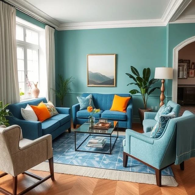
Analogous colors sit next to each other on the color wheel. Blue, blue-green, and green. Or red, red-orange, and orange. Because they share underlying hues, they blend easily and create a sense of harmony. Designers use analogous schemes when they want a calm, cohesive look without much tension. The effect is gentle. Nothing clashes. Everything feels related.
The risk is monotony. A palette of three adjacent blues may be harmonious but also boring. Designers often introduce a small accent from elsewhere on the wheel to add life. A mostly analogous scheme with one complementary accent gives the best of both: harmony with a focal point. Nature provides analogous palettes constantly. A forest scene moves through greens, yellows, and browns. A sunset blends red, orange, and purple.
Where analogous schemes work
- Branding that needs a calm, unified feel.
- Interiors with layered tones of one family.
- Data visualization with related categories.
- Illustration with soft, natural transitions.
Analogous colors are forgiving. They rarely produce jarring combinations. But they need a deliberate accent to keep the viewer engaged.
Comments
No comments yet. Be the first to share a thought.
Leave a comment