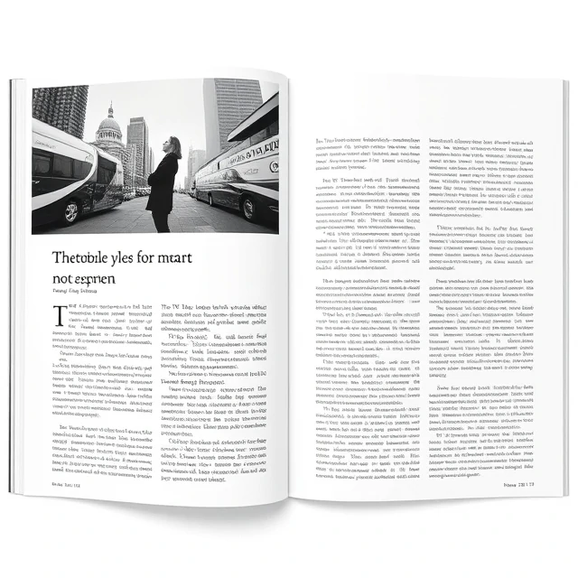
Asymmetry distributes visual weight unevenly. The left side of a layout is heavier than the right. A large image on one side balances a small block of text on the other. The composition is not mirrored, but it still feels balanced. Asymmetry creates tension and movement. It is more dynamic than symmetry and often more interesting.
The challenge is achieving balance without mirroring. A large element on one side needs a counterweight on the other. That counterweight can be a smaller element with high contrast, a bright color, or a complex texture. Visual weight depends on size, color, contrast, and position. A small red dot can balance a large gray rectangle. The designer's eye learns to feel these relationships. Asymmetry is common in modern design. Web layouts often use asymmetric grids. Editorial design breaks the column structure with images that span multiple columns or sit off the edge. Posters use asymmetry to create drama. Symmetry feels stable and formal. Asymmetry feels energetic and contemporary. Neither is better. The choice depends on the message and the mood. A bank might prefer symmetry for trust. A startup might prefer asymmetry for innovation. The composition communicates before the content does.
Asymmetry in practice
- Use visual weight, not just size, to balance
- Contrast and color can offset large elements
- Break the grid deliberately, not accidentally
- Test the composition by squinting at it
- Balance does not mean equal
Asymmetry is balance without mirroring. The composition is stable, but it is not static.
Comments
No comments yet. Be the first to share a thought.
Leave a comment